What’s the Role of Burndown Chart in the World of Scrum?
Many times, you feel like you can accomplish anything during your work hours, but there isn’t enough time in the day to get every little task done. The plans are all there, the motivation is simply perfect and all you need to get started is a reference point. That’s where a burndown chart might come in handy.
In short, a burndown chart in a scrum or any other Agile framework helps to identify completed work against the actual project completion rate. This way, you can spot out people who are slacking and get them to speed. In addition, it also helps you to see which areas of the project need the most attention. Then you can gradually divert resources to those areas to get the gears spinning.
If you have been a part of this fast-paced market for even 2 seconds in your professional career, then you know that the managers of today want their employees to get everything done within seconds. Even though it’s impossible, they have only one agenda and that is to get everything done fast.
This is all the more reason for clever managers to control the time constraint for their teams so that they can control productivity. To do that, they require all of the data related to the time and work done by the team.
This data collection will make sure that the managers will have enough information to get the project in question completed within the allotted budget and time . Burndown charts help them to do just that. Let’s start at the very beginning.
What is Burndown Chart?
Source
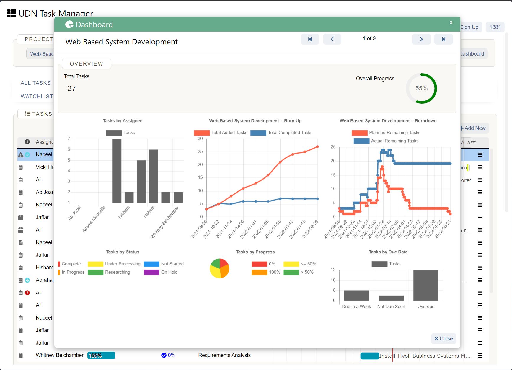
Basically, a burndown chart is a visual depiction of a graph of how the development team works through a user story. It is an agile tool’s most important feature that is used to encapsulate a thorough description of a new feature added to the project, from a consumer’s perspective.
The two axes on which this graph is drawn are the total effort that the team puts in during each iteration against the actual amount of work done by the team during those intervals or iterations.
If we look at the design of the chart, we see that the quantity of work that is to be done by the team is shown on the vertical axis and the time that has been spent working on the project by the team, is shown on the horizontal axis, which is generally known to be the time axis.
The burndown chart is openly displayed to everyone related to the project, to make sure that everyone is on the same page about the progress that the team has made. This chart is updated regularly to keep everyone up to date and avoid any bottlenecks.
There are two different variations when it comes to burndown charts. They are:
How to Monitor a Burndown Chart?
Reading or Monitoring a Burndown chart is a very important skill that every manager should have if they want to keep track of the data that is going to help them increase the productivity of their team.
Reading a Burndown chart has several important steps that you need to know. They are:
What are the Benefits of a Burndown Chart?
The most general and obvious benefit of a burndown chart in agile is its ability to provide a thoroughly updated report on the progress of all of the activities happening within a project.
Having this type of information and visual representation of it Infront of the whole team keeps everyone on the same page.
Also, when this type of information is available for everyone to see, all of the team members can work together and work out any scope creeps that may or may not affect the project later on so that they can get rid of them as soon as possible.
Therefore, the burndown chart must be as big and detailed as possible.
Another important benefit of a burndown chart is that it is extremely easy to craft and quite useful to monitor the history of the project as well as the current velocity and trajectory of the project.
What are the Boundaries of a Burndown Chart?
Source
As beneficial as the burndown chart is, it still really doesn’t reveal EVERYTHING per se. For example, it will show you all of the story points that have been completed in the project or the iteration but it won’t show you any changes that have occurred during the completion of those story points.
Therefore, it can be very frustrating when we can’t figure out whether the changes that are being shown in the burndown chart are because of the increase or decrease in story points or whether the backlog items have been completed.
If you have a burnup chart, then you can probably resolve this issue by having a separate representation of a line in the graph to cover the overall backlog size.
But keep one thing in mind, that neither a burnup or a burndown chart is going to offer any indication of the backlog items that have been completed in the iteration or the project.
Therefore, burndown charts might show progress related to the iteration or the project but they will never show whether the team is working on the right thing or not.
One other issue that is very common with burndown charts is the concerns of accuracy regarding the ideal work line.
Whether the actual line is above or below the ideal work line generated by the graph depends on the accuracy of the original time estimates provided to generate the burndown chart in the first place.
So, if you see a team overestimating the time requirements provided to them, the progress of the project development or the work done in the iteration will appear to be on track and on time, if not ahead of schedule.
But if that team is underestimating the time requirements provided to them, the progress of the project development or the work done in the iteration will appear to be off track and it will appear as if they are behind schedule.
What is the Role of Burndown Charts in the World of Scrum?
One of the most important and fundamental metrics that is currently being used in the market is the burndown chart. This is an incredible necessity of the development team that allows them to track the progress of the tasks being worked on in the iteration .
Since these charts can update the scrum masters daily about the progress of the tasks being performed in the iterations, they can very easily predict whether their development team will be able to achieve the target that their manager has set for them.
What is the Information that a Burndown Chart shows in an Agile Scrum Methodology?

Source: Agilenutshell.com
In the Scrum methodology, the burndown chart shows the following information:
A proper burndown chart is the culmination of all of the efforts in terms of hours spent on the issues, user-stories and the tickets related to the iteration or the project. Basically, this is the total sum of hours that are spent on project development by the team members.
This is one of the most important information that the chart visualizes and how it gets its name. The amount of work or effort being done in the iteration is an integral part of the burndown chart representation.
The team will burndown little pieces of effort every single day so that on the very last day of the development process, there is no work effort remaining.
Read this blog:
Flow Charting Made Simple!
Since all the team members have to carefully work out the items that they are going to work on, on a daily basis, all of the days of the commitment of work are shown in the burndown chart.
These days include all of the working days that the team members spend in a sprint excluding weekends, national holidays or general holidays, etc. This all comes out to be the total sprint duration.
The ideal effort is shown in the chart as a guide for all of the team members so that they can have a proper idea of the remaining effort that they have to burn down to achieve what they set out to accomplish in the first place.
This is why, in a burndown chart, you see a line going straight from the top of y to the x-axis. This is the very last day of the sprint.
The Remaining effort line is different from team to team as it represents the effort left to be applied by the team members regarding a specific iteration or a project development process.
The effort remaining line depends on the amount of effort that will be added to the roster or reduced from it, daily.
What is the Relation between the Burndown Chart and Scrum Team?
One thing you need to remember during every sprint being performed according to the agile scrum methodology is that the team selects the tasks or activities that they want to work on.
All of this is done by a selection process using which the team tracks and analyses all of the tasks that are to be worked on.
All of the dependencies and tasks priorities are decided in this process as well as estimation is also generated on the possible timeline on when a task will be developed completely.
When you combine all of these findings and estimations of the tasks being decided to be worked on by the team, you get an amount of data regarding the “ Effort Remaining ”.
When this data regarding Effort Remaining is gathered, it is divided further into the number of days that are included in the sprint duration. These hours are the time duration according to which the team members will work on every task that is included in the iteration or the project.
On the burndown chart visualization, this time is shown on the y-axis and the effort remaining is shown in the form of story points .
Sprint Burndown Chart in Agile
The sprint burndown is a very important concept to be studied and applied by the project managers of the current market. This is because sprint burndown charts can help managers:
What is a Release Burndown Chart?
The release burndown chart is the final nail in the coffin that tracks all of the progress made by the team during project development or an iteration. The y-axis of the chart shows the story points or hours and the x-axis shows the time spent by the team members.
When you have properly analyzed a release burndown chart, you can answer all the questions, such as, but not limited to the following scenarios:
Are You Using Burndown Charts In Your Organization?
If you haven’t used a burndown chart for your company, we would like to know why. Does the concept of Epics, Sprints, and Scrum seem mundane to you? A burndown chart or anything that represents a measure of actual vs. planned performance metrics is a great tool. If you haven’t tried it, do give it a shot.
As of right now, the industry is brimming with several resources that assist in implementing burndown charts on any number of ongoing projects. In fact, you can look up tutorials and learning materials to get started. In case of any questions, feel free to reach out to us through the comments section below. We would love to get some insight from you on the subject matter.


