How To Create A Dashboard In Excel? (2022 Guide)
Udn Webber
Managing Editor
Looking to learn how to create a dashboard in Excel ?
Gathering data is an essential process to better understand how your projects are moving. And what better way to manage all that data than spreadsheets?
However, data on its own is just a bunch of numbers. 😝
To make it accessible, you need dashboards .
In this article, we’ll learn about Excel dashboards.
We’ll go over the steps to create one and also highlight a smoother alternative to the entire process.
Let’s start.
What Is A Dashboard in Excel?
A dashboard is a visual representation of KPIs , key metrics , and other complex data in a way that’s easy to understand.
Let’s be real, raw data and numbers are essential, but they’re super boring and…
That’s why you need to make that data accessible.
What you need is a Microsoft Excel dashboard.
Luckily, you can create both a static or dynamic dashboard in Excel.
What’s the difference?
Static dashboards simply highlight data from a specific timeframe. It never changes.
On the other hand, dynamic dashboards are updated daily to keep up with changes.
So what are the benefits of creating an Excel dashboard ?
Similar to Google Sheets dashboards , let’s a look at some of them:
7 Steps To Create A Dashboard In Excel
Here’s a simple step-by-step guide on how to create a dashboard in Excel.
Step 1: Import the necessary data into Excel
No data . No dashboard .
So the first thing to do is to bring data into Microsoft Excel.
If your data already exists in Excel, do a victory dance 💃 because you’re lucky you can skip this step.
If that isn’t the case, we’ve got to warn you that importing data to Excel can be a bit bothersome. However, there are multiple ways to do it.
To import data, you can:
The most suitable way will ultimately depend on your data file type, and you may have to research the best ways to import data into Excel.
Step 2: Set up your workbook
Now that your data is in Excel, it’s time to insert tabs to set up your workbook.
Open a new Excel workbook and add two or more worksheets (or tabs) to it.
For example, let’s say we create three tabs.
Name the first worksheet as ‘ Raw Data ,’ the second as ‘ Chart Data ,’ and the third as ‘ Dashboard .’
This makes it easy to compare the data in your Excel file.
Here, we’ve collected raw data of four projects: A, B, C, and D.
The data includes:
Step 3: Add raw data to a table
The raw data worksheet you created in your workbook must be in an Excel table format, with each data point recorded in cells.
Some people call this step “ cleaning your data” because this is the time to spot any typos or in-your-face errors.
Don’t skip this, or you won’t be able to use any Excel formula later on.
Step 4: Data analysis
While this step might just tire your brain out, it’ll help create the right dashboard for your needs.
Take a good look at all the raw data you’ve gathered, study it, and determine what you want to use in the dashboard sheet.
Add those data points to your ‘Chart Data’ worksheet.
For example, we want our chart to highlight the project name, the month of completion, and the budget. So we copy these three Excel data columns and paste them into the chart data tab.
Here’s a tip : Ask yourself what the purpose of the dashboard is.
In our example, we want to visualize the expenses of different projects.
Knowing the purpose should ease the job and help you filter out all the unnecessary data.
Analyzing your data will also help you understand the different tools you may want to use in your dashboard.
Some of the options include:
Step 5: Determine the visuals
What’s a dashboard without visuals, right?
The next step is to determine the visuals and the dashboard design that best represents your data.
You should mainly pay attention to the different chart types Excel gives you, like:
Step 6: Create your Excel dashboard

You now have all the data you need, and you know the purpose of the dashboard.
The only thing left to do is build the Excel dashboard.
To explain the process of creating a dashboard in Excel, we’ll use a clustered column chart .
A clustered column chart consists of clustered, horizontal columns that represent more than one data series.
Start by clicking on the dashboard worksheet or tab that you created in your workbook.
Then click on ‘ Insert ’ > ‘ Column ’ > ‘ Clustered column chart ’.
See the blank box ? That’s where you’ll feed your spreadsheet data.
Just right-click on the blank box and then click on ‘ Select data ’
Then, go to your ‘Chart Data’ tab and select the data you wish to display on your dashboard.
Make sure you don’t select the column headers while selecting the data.
Hit enter , and voila, you’ve created a column chart dashboard.
If you notice your horizontal axis doesn’t represent what you want, you can edit it.
All you have to do is: select the chart again > right-click > select data.
The Select Data Source dialogue box will appear.
Here, you can click on ‘ Edit ’ in the ‘ Horizontal (Category) Axis Labels ’ and then select the data you want to show on the X-axis from the ‘Chart Data’ tab again.
Want to give a title to your chart ?
Select the chart and then click on Design > chart layouts . Choose a layout that has a chart title text box.
Click on the text box to type in a new title.
Step 7: Customize your dashboard
Another step?
You can also customize the colors, fonts, typography, and layouts of your charts.
Additionally, if you wish to make an interactive dashboard, go for a dynamic chart.
A dynamic chart is a regular Excel chart where data updates automatically as you change the data source.
You can bring interactivity using Excel features like:
And we’re done. Congratulations! 🙌
Now you know how to make a dashboard in Excel.
We know what you’re thinking: do I really need these steps when I could just use templates?
3 Excel Dashboard Templates
Excel is no beauty queen. And its scary formulas 👻 make it complicated for many.
No wonder people look for a quality advanced Excel or Excel dashboard course online.
Don’t worry.
Save yourself the trouble with these handy downloadable Microsoft Excel dashboard templates.
1. KPI dashboard template
Download this revenue and expense KPI dashboard template .
2. Project management dashboard template
Download this project dashboard template .
3. Sales dashboard template
Download this free sales Excel dashboard template .
However, note that most Excel templates available on the web aren’t reliable, and it’s difficult to spot the ones that’ll work.
Most importantly, Microsoft Excel isn’t a perfect tool for creating dashboards .
Here’s why:
3 Limitations Of An Excel Dashboard
Excel may be the go-to tool for many businesses for all kinds of data.
However, that doesn’t make it an ideal medium for creating dashboards.
Here’s why:
1. A ton of manual data feeding
You’ve probably seen some great Excel workbooks over time.
They’re so clean and organized with just data after data and several charts.
But that’s what you see. 👀
Ask the person who made the Excel sheets, and they’ll tell you how they’ve aged twice while making an Excel dashboard, and they probably hate their job because of it.
It’s just too much manual effort for feeding data.
And we live in a world where robots do surgeries on humans!🙀
2. High possibilities of human error
As your business grows, so does your data.
And more data means opportunities for human error.
Whether it’s a typo that changed the number ‘5’ to the letter ‘T’ or an error in the formula, it’s so easy to mess up data on Excel.
If only it were that easy to create an Excel dashboard instead. 😒
3. Limited integrations
Integrating your software with other apps allows you to multitask and expand your scope of work. It also saves you the time spent toggling between windows.
However, you can’t do this on Excel, thanks to its limited direct integration abilities.
The only option you have is to take the help of third-party apps like Zapier.
That’s like using one app to be able to use another.
Want to find out more ways in which Excel dashboards flop?
Check out our article on Excel project management and Excel alternatives .
This begs the question: why go through so much trouble to create a dashboard?
Life would be much easier if there were software that created dashboards with just a few clicks.
And no, you don’t have to find a Genie to make such wishes come true. 🧞
You have something better in the real world, UDN Task Manager , the world’s highest-rated productivity tool !
Create Effortless Dashboards With UDN Task Manager
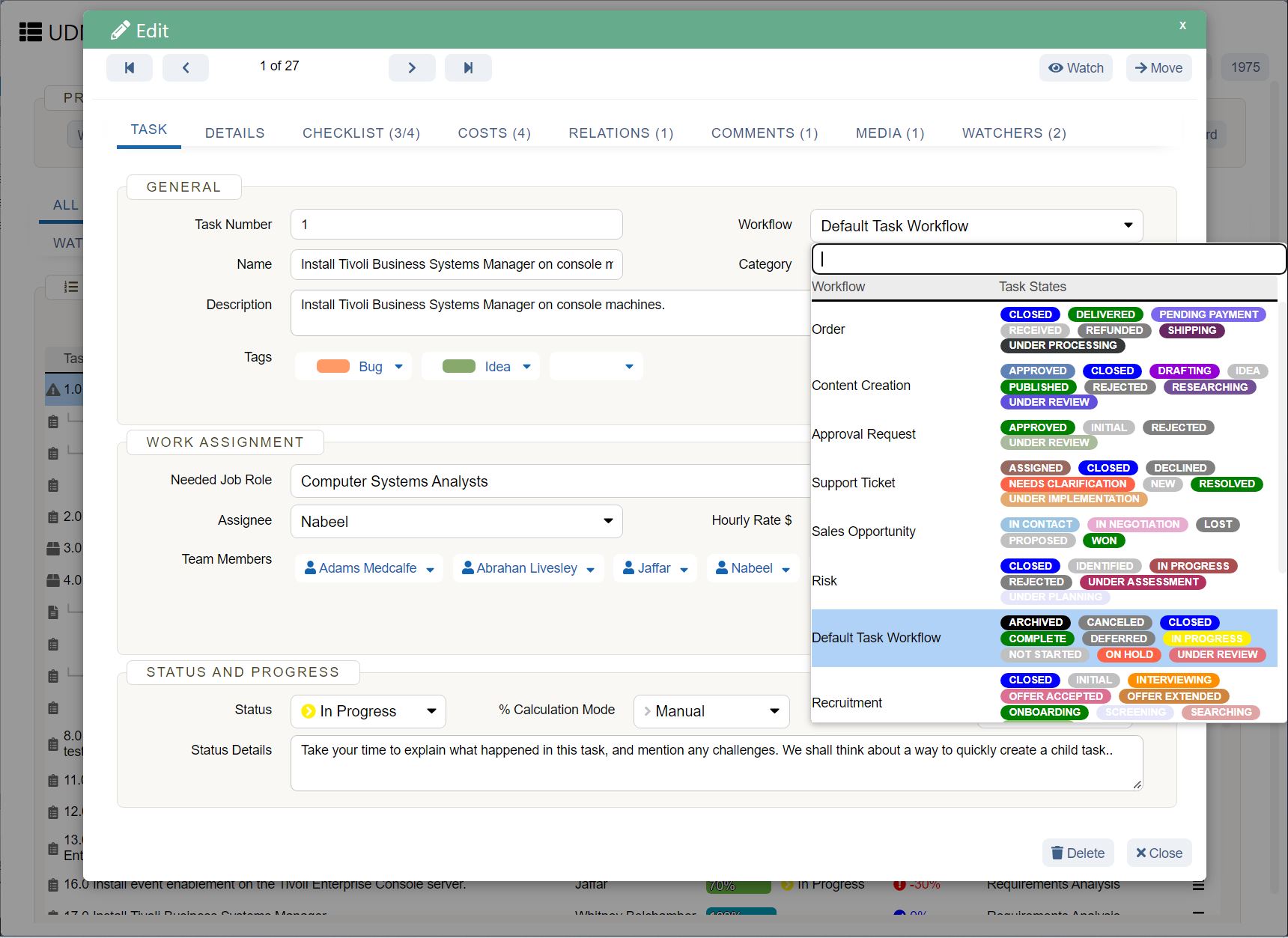
UDN Task Manager is the place to be for all things project management.
Whether you want to track projects and tasks, need a reporting tool, or manage resources , UDN Task Manager can handle it.
Most importantly, it is THE tool for quick and easy dashboard creation.
So how easy are we talking?
As easy as three steps that are literally just mouse clicks.
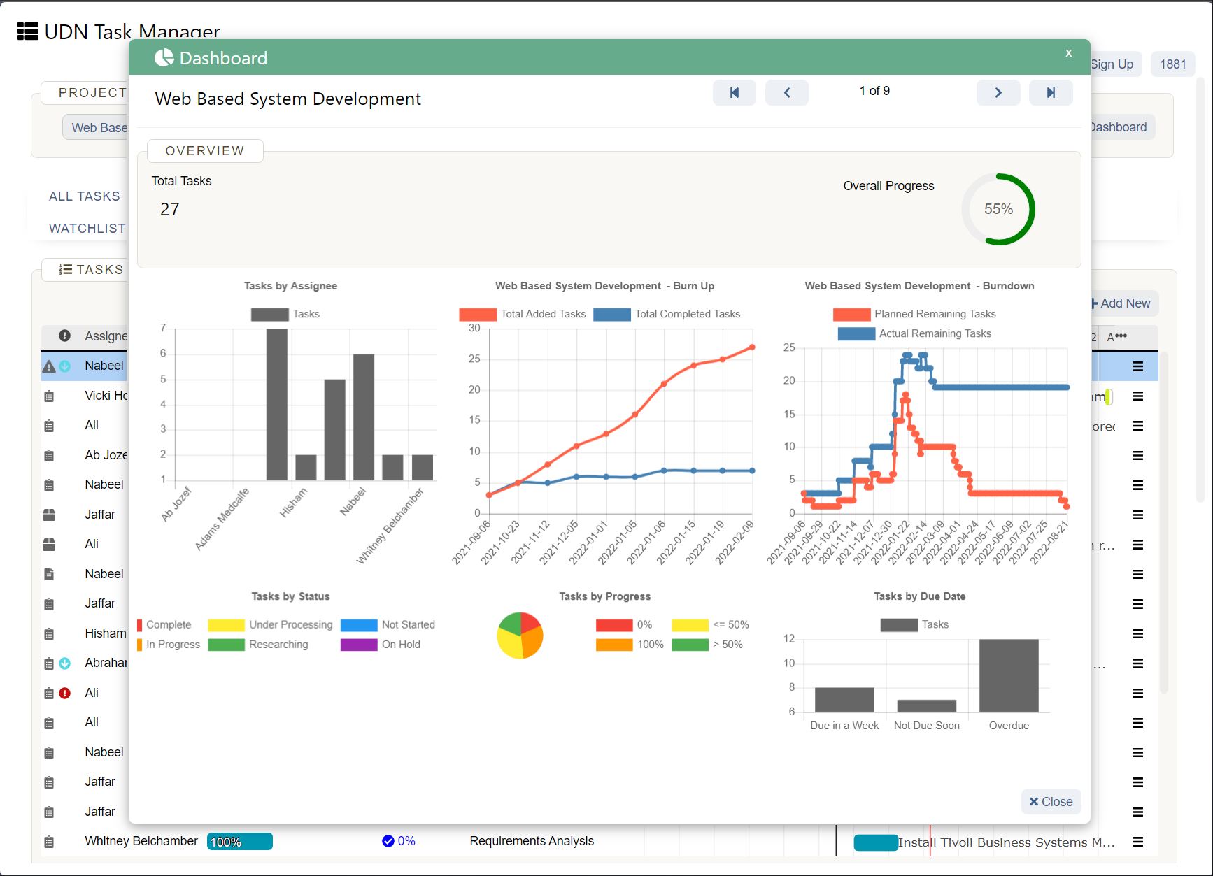
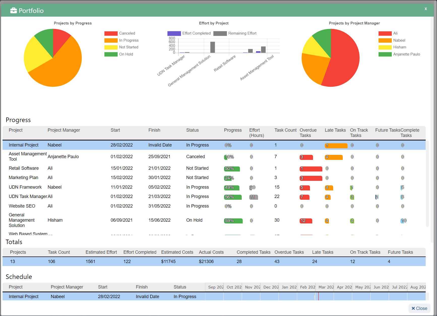
UDN Task Manager ’s Dashboards are where you’ll get accurate and valuable insights and reports on projects, resources , tasks, Sprints , and more.
Once you’ve enabled the Dashboards ClickApp:
Now that was super easy, right?
To power up your dashboard, here are some widgets you’ll need and love:
Don’t forget the Sprint Widgets on UDN Task Manager ’s Dashboards.
Use them to gain insights on sprints, a must-have feature for your Agile and Scrum projects.
It’s an easy way to enjoy full control and a complete overview of every happening in your Agile workflow .
You can even access UDN Task Manager Dashboards on the go, right on your mobile devices.
We will soon release Dashboard Templates as well, just to add more convenience to what’s already super easy.
You’re welcome! 😇
Need some help creating a project management dashboard ?
Check out our simple guide on how to build a dashboard .
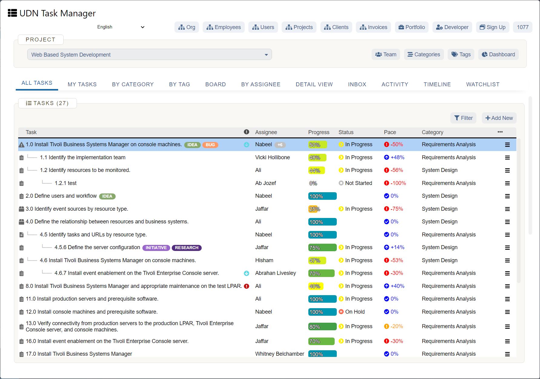
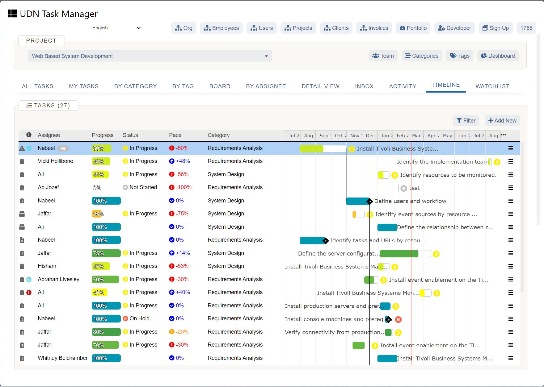
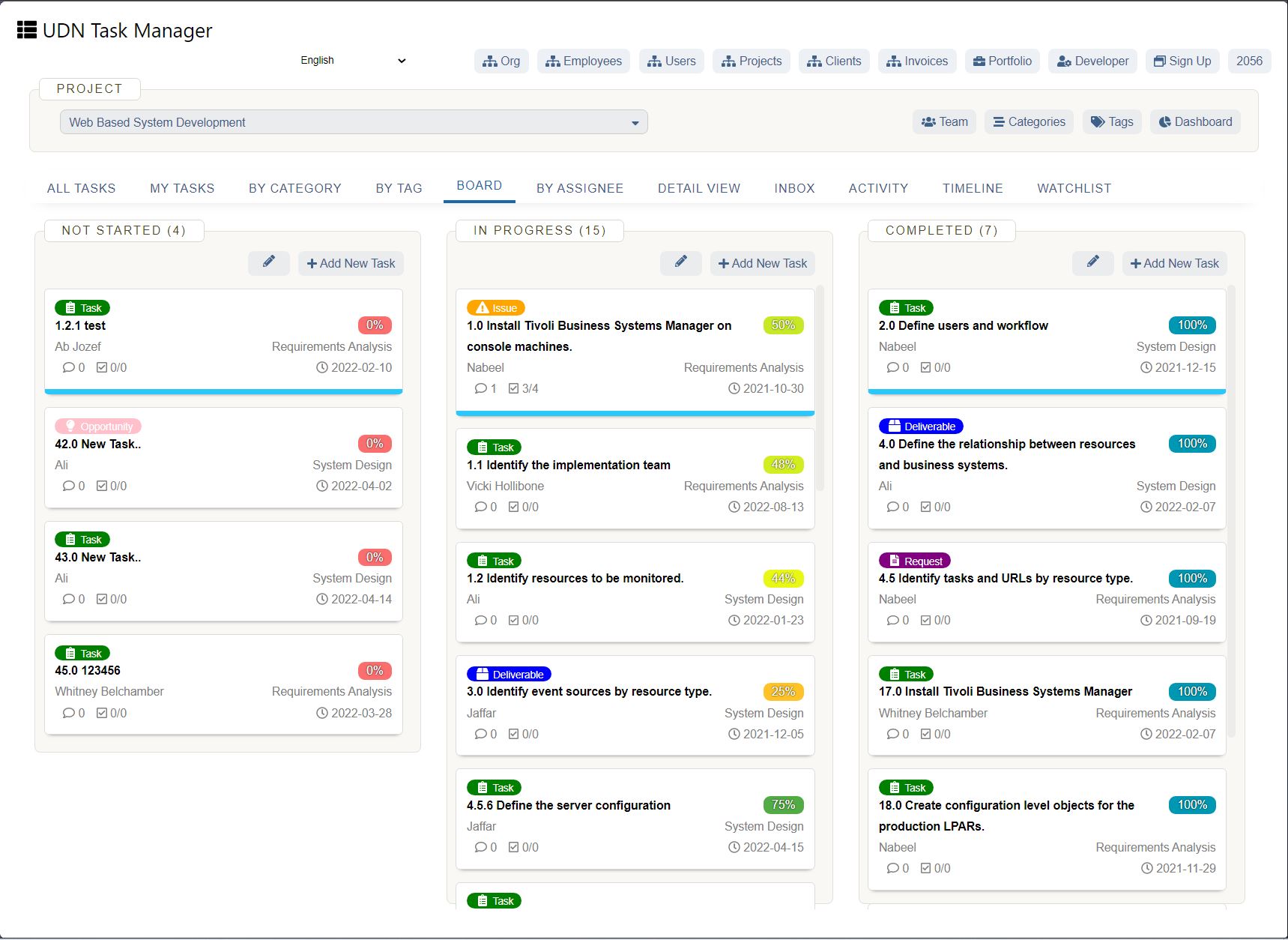
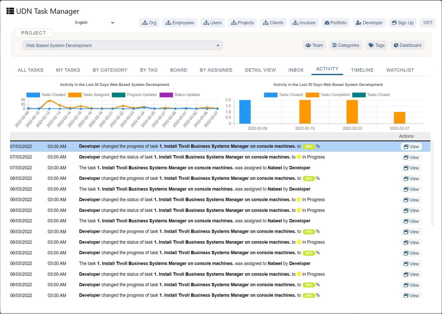
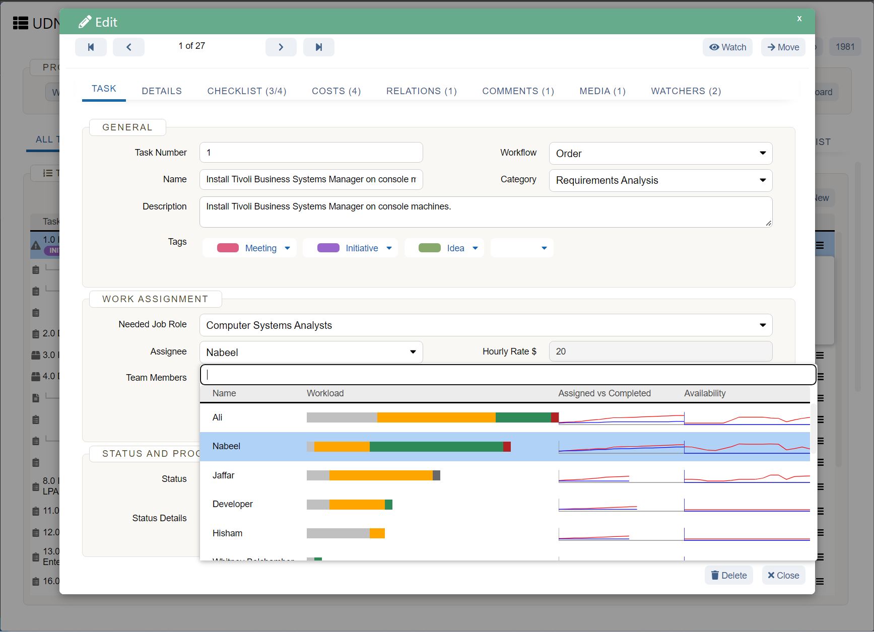
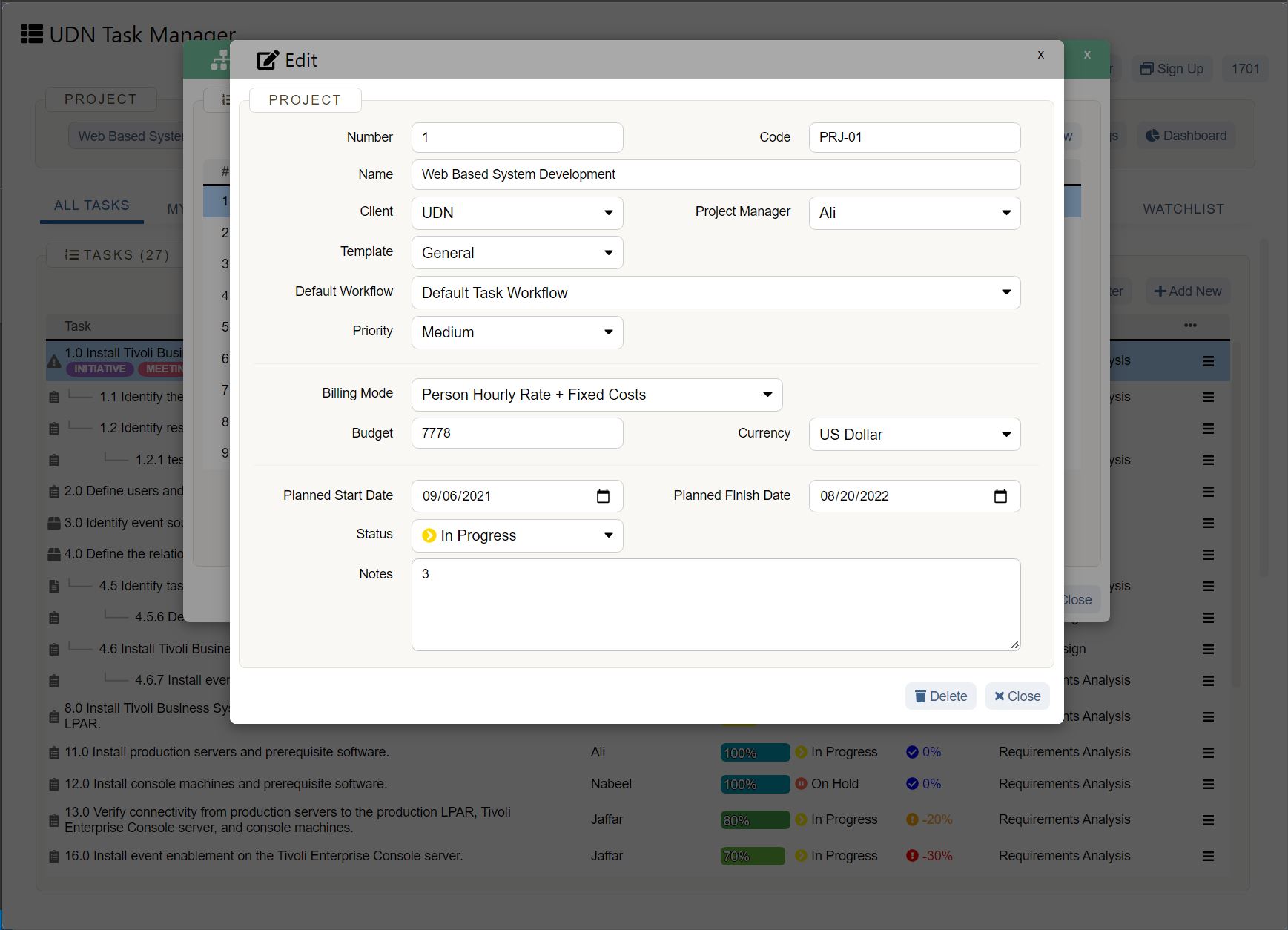
Here’s a tiny glimpse of some of our cool features :
Can You Really Excel With Excel Dashboards?
While you can use Excel to create dashboards, it’s no guarantee that your journey will be smooth, fast, or error-free.
The only place to guarantee all that is UDN Task Manager !
It’s your all-in-one project management and dashboard reporting replacement for Excel dashboards and even MS Excel spreadsheets.
Why wait when you can create unlimited tasks, automate your work, track progress, and gain insightful reports with a single tool?
Get UDN Task Manager for free today and create complex dashboards in the simplest of ways!


