Top 8 Project Management Charts to Use in 2022
If you are working in the field of project management, then you may have noticed that all of these amazing tasks and processes that are a part of it lack visual panache.
Visual appeal in the year 2021 is everything. They save time for people with a short attention span (*which we are all guilty of) and help to get things initiated faster.
Whether you take your personal life as an example of your professional life, if there is no visual appeal in it, then people or clients don’t think twice about rejecting your work.
This is where project management charts come in.
Project management charts are an amazing visual to present your work that even the most boring or snore-worthy presentations might even put the presenter to sleep, look pleasing, and more bearable.
And when it comes to project management, there is a very important function that these charts perform, and that function is:
Breaking down all of the project data at hand into smaller more bite-sized pieces, so that everyone related to the project has all of the knowledge related to it and everyone is on the same page.
But as with applications and other things related to project management, there are a lot of different options of charts to choose from.
All of these options depend on the type of projects that you are performing for your business and believe us that they are a LOT OF THEM .
That’s why in this article, we are going to talk about 8 of the best project management charts that you can use in 2021, to make sure that your project development process is properly described and managed, and there are no empty spaces.
So, let’s start from the very beginning and find out what are project management charts.
Project Management Charts
A project management chart is a visual representation of all of the tasks and processes that are being performed or will be performed in the future, as a part of the project development process.
This project management data, apart from tasks and processes, can also include the timeline of different project events that have to be performed in just the right durations, otherwise, the whole thing can fall apart.
And if you are thinking of using MS Excel or PowerPoint for this, then you should think twice, because although both of those applications are capable of handling your project data, they can’t do one thing that charts can easily do.
And that is to Visualize your data . Meaning that you won’t have to go through all of those lengthy documents every single time if you want a little piece of information about the project.
Project management charts can also help you in:
So, without further ado, let’s talk about these project management charts already.
8 PM Charts to Use in 2022
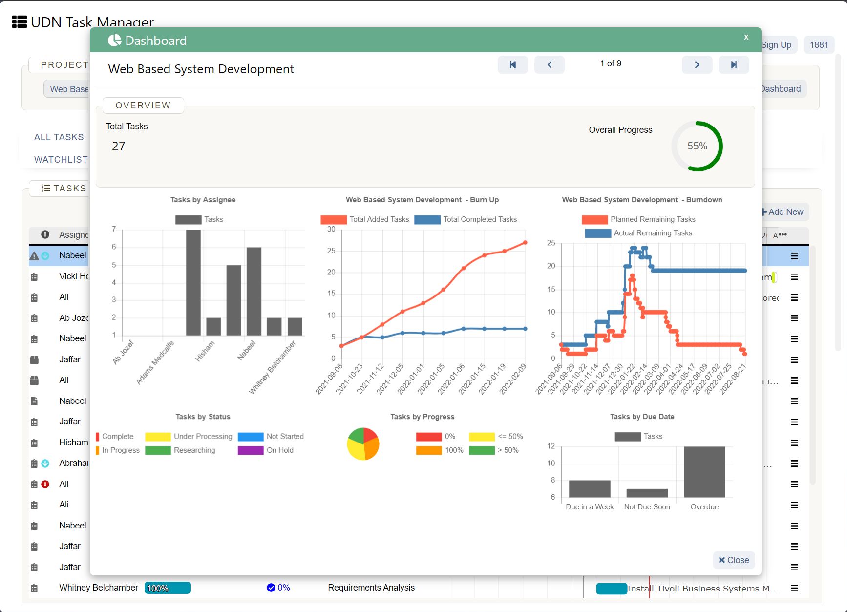
Here’s a list of all of the charts that we are going to talk about in this article.
Let’s take a detailed look at all of the project management charts and find out how effective they are and how important they can be for your business.
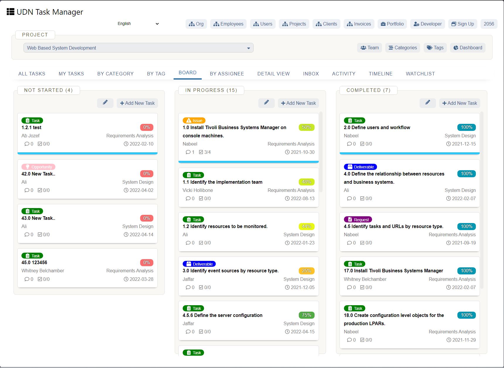
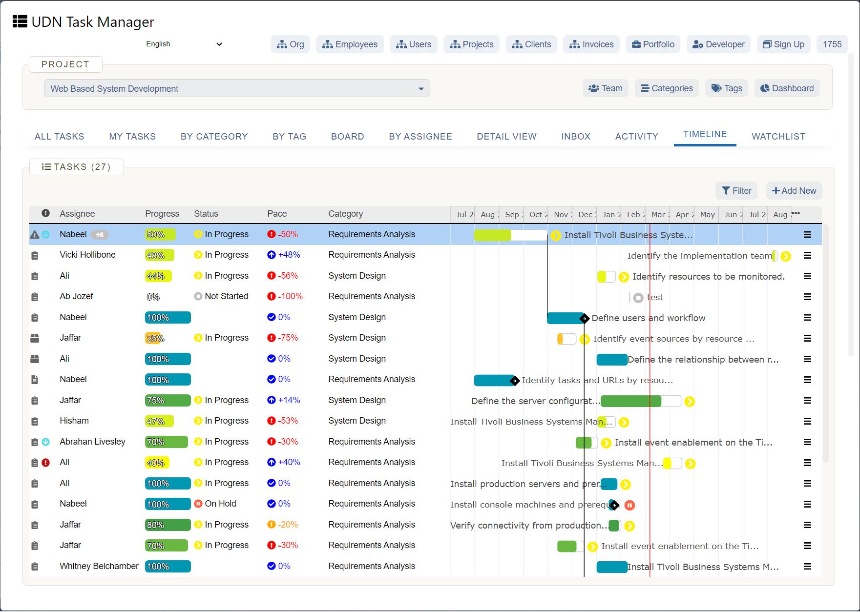
Interactive Gantt Charts in UDN Task Manager App
Gantt charts are one of the most visually appealing charts that we are going to discuss in this article. It is an amazing visual overview of every task and process that is going to be worked on in the project over a specific time duration.
Some of the task details that these amazing project management charts highlights are:
You might have seen the word task dependency and task durations written above. Want us to explain them a bit further?
Well, task dependency is a relationship between two tasks where one task has to be completed first, in order to start performing the second task.
And task durations are the amount of time allocated or needed to make sure that the task is performed and performed accurately so that the work is completed and the resources are not overworked.
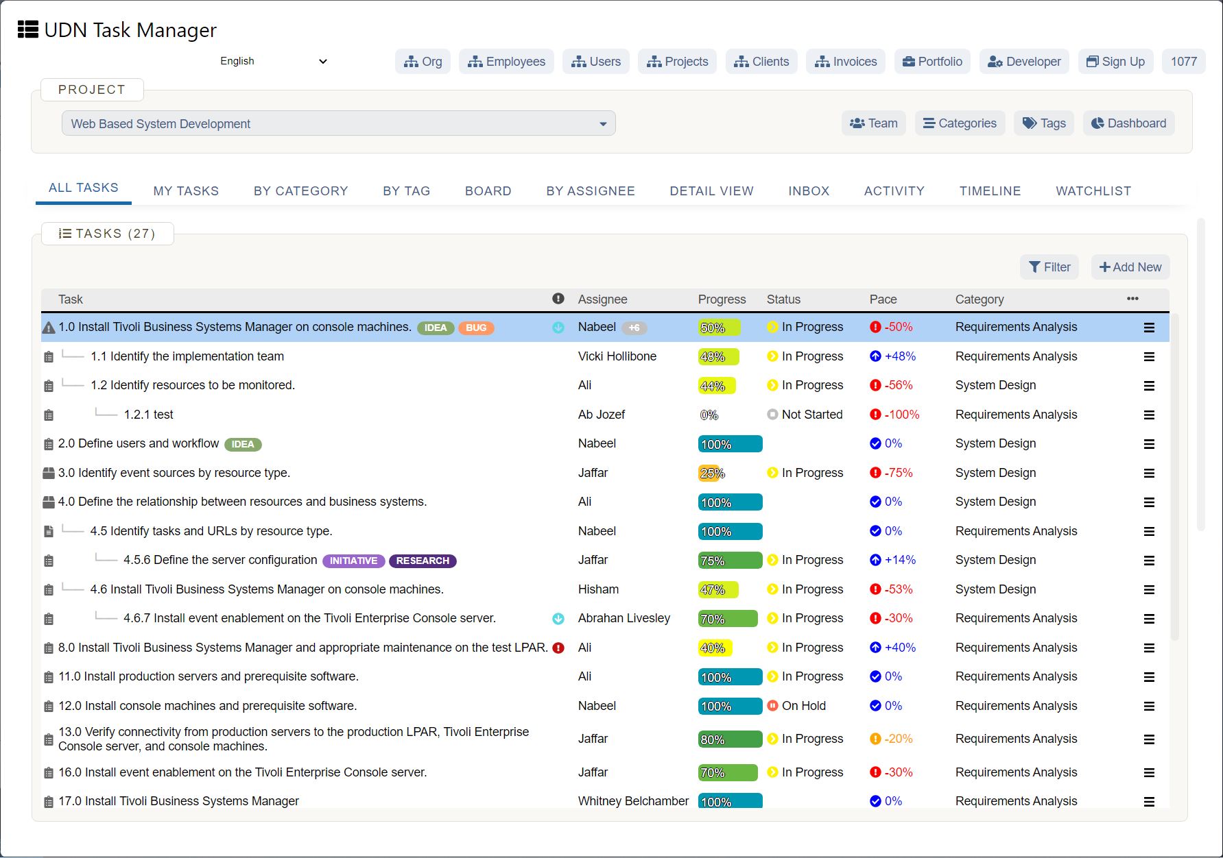
If you want to explore Gantt charting and fiddle around with task dependencies and task durations, check out UDN Task Manager . It is an incredible project management software that has this amazing project management chart embedded deep into its ecosystem.
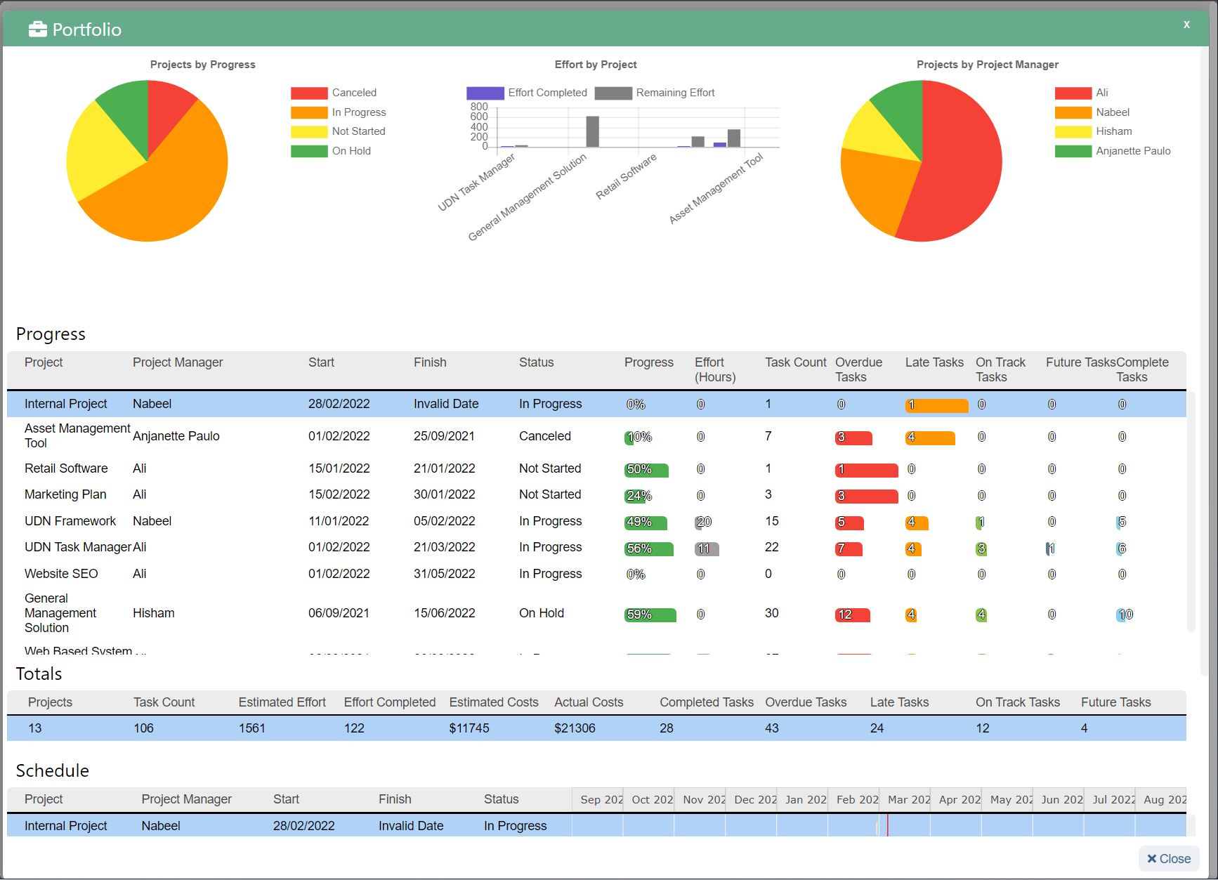
A bar chart is basically a chart containing rectangular bars. These rectangular bars have lengths and heights proportional to the frequencies and values that they represent, regarding the project.
You can basically use the bar chart to:
A WBS is an incredible project management chart as it lays out the whole project development process into a tree-like structure of tasks that can be easily organized, managed, and performed.
This amazing chart helps us to break down the whole project into smaller components, which can, in turn, be used to:
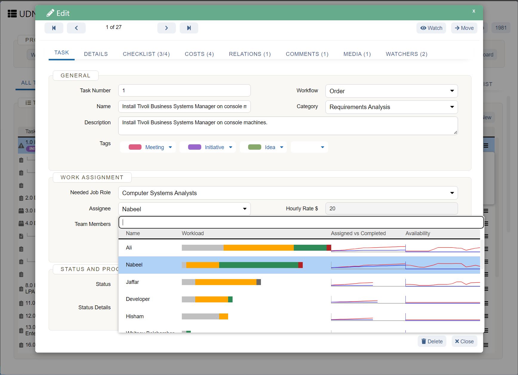
The stakeholder analysis matrix is an amazing project management tool that allows you to visualize all of the stakeholders and their involvement in the project development process easily.
Here are some of the things that you can do using this project management chart.

A project timeline chart is basically a graphical representation of all of the goals and milestones that the upper management or the project management has set for the project and the project development team.
This chart can easily help you in:
A cumulative flow chart is an incredibly useful tool for Agile and Kanban project management methodologies.
Basically, the project managers can use this chart to visualize how the tasks associated with the project development process are progressing along and also identifying the potential roadblocks that can hinder their development.
This project management chart can also be used to track:
This project management chart represents the cumulative number of all of the defects in a product or the project development process, and also the frequency of these defects. These defects can be anything affecting the quality of the project development process.
You can use this amazing chart to:
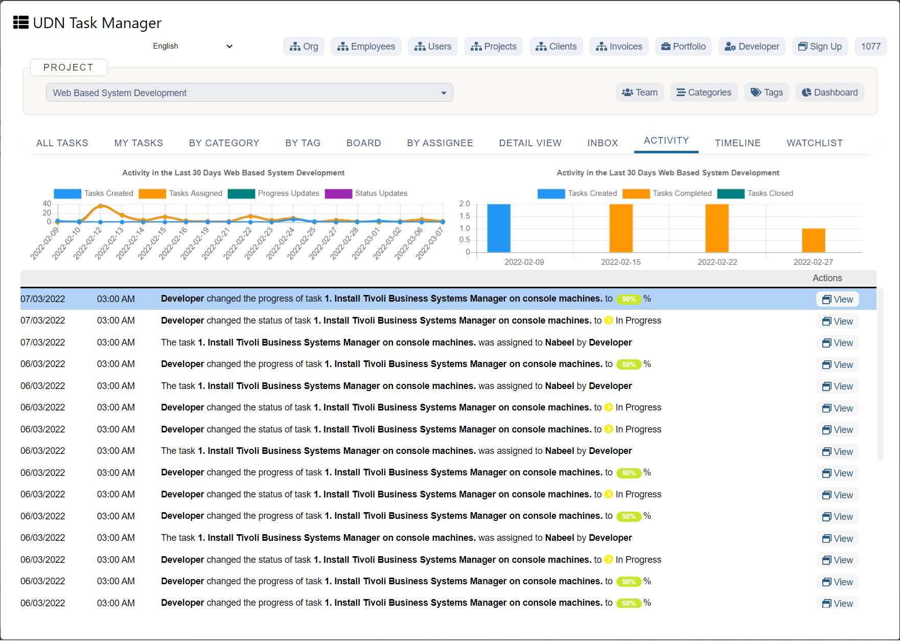
Last but not least, Pie chart. This project management chart divides different categories of data related to the project management process into slices. Each of these slices has its own specific identity.
The arc length of each slice in this pie chart corresponds to the quantity of information that it represents regarding the project.
Conclusion
These were our top picks for the best project management charts that you can use right now. As we mentioned above, there are a lot more of these ways to visualize your project development process data, which can be more suitable to your needs and requirements, than these.
So, make sure that you read about all of these, and if you want some other charts that have helped you in your work, contact us and let us know so that we can mention them on our blogs.


