Burndown chart: What it is and how to use it (with example)
Summary
A burndown chart is a graph that represents the work left to do versus the time it takes to complete it. It can be especially useful for teams working in sprints as it can effectively show whether your deadlines are able to be met along the way. Find out how to create your own burndown chart.
You start your Monday off with a sprint meeting. You find out there was an issue with development which could set you back a couple of days. You wonder, is there even enough time to get it all done by next week?
Most of us have been in a similar time crunch scenario, and finding enough time in your team’s schedule to complete your projects can be challenging. That’s where a burndown chart comes in.
A burndown chart helps analyze the work you have to do versus the time it takes you to complete it. This can be an excellent tool to visualize and better manage your team’s workload so you can prioritize your schedule. Let’s dig into what a burndown chart is and how to create one of your own.
What is a burndown chart?
A burndown chart is a visual representation of the remaining work versus the time required to complete it. By estimating the time it takes to complete tasks, issues, and testing, you can determine the project completion date.
A burndown chart is used to efficiently calculate whether your team has enough time to complete their work, and is commonly used while working in short iterations. Not only can it help determine project completion dates, but it can also give you insight into how your team works.
There are two types of burndown charts: Agile burndown charts and sprint burndown charts. An Agile burndown chart is used by Agile teams to enable tasks to move quickly. A sprint burndown chart is used by development teams when working in short sprints.
Need help with sprint planning? Use our sprint planning template to keep your next sprint on track.
Burndown chart vs. burnup chart
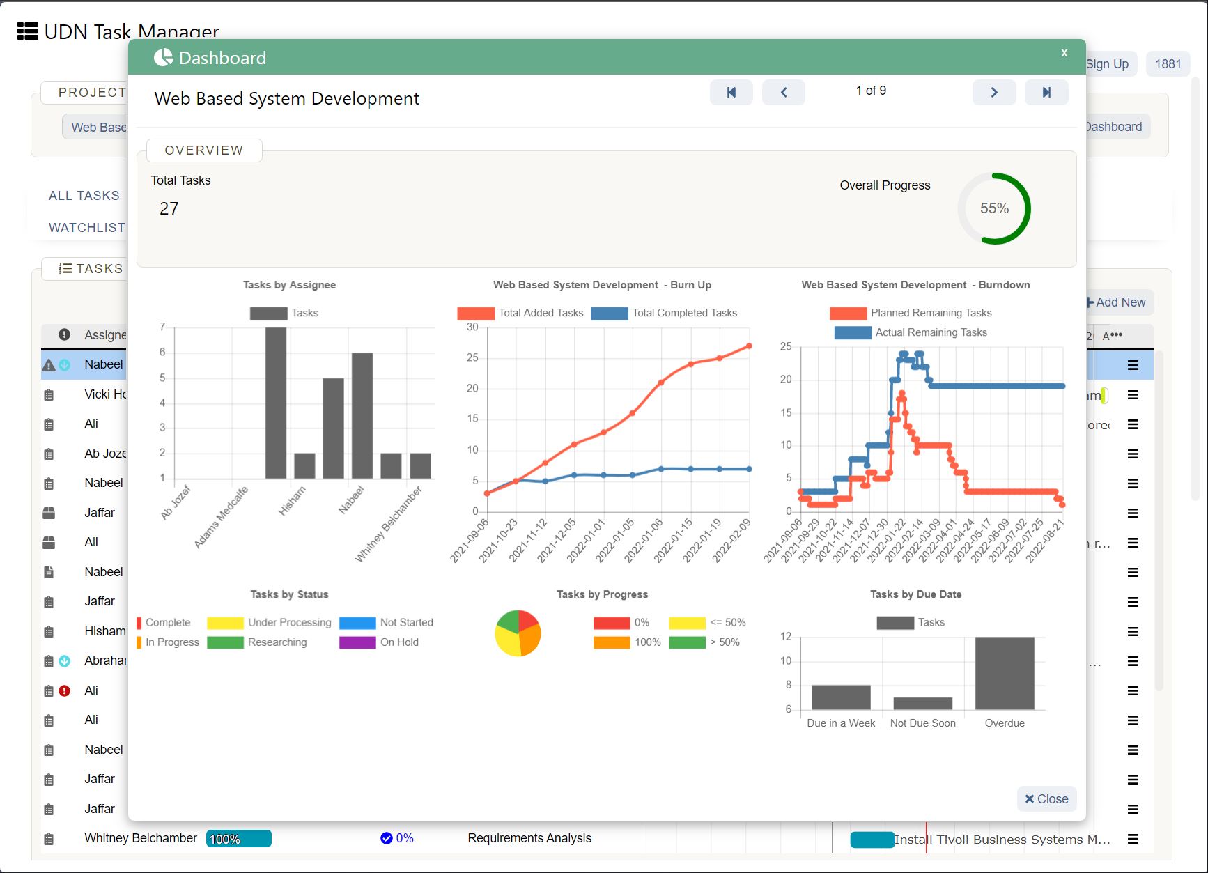
A burnup chart is used to track how much work has been completed. Both a burndown chart and a burnup chart keep you informed about different moving parts within a project, which is why they are frequently used together.
How does a burndown chart work?
A burndown chart works by estimating the amount of work needed to be completed and mapping it against the time it takes to complete work. The objective is to accurately depict time allocations and to plan for future resources.
Burndown charts are used by a variety of teams, but are most commonly used by Agile teams . That’s because these charts are best at analyzing short iterations such as sprints. Now that you know how a burndown chart works, let’s find out how to read a burndown chart.
How to read a burndown chart
A burndown chart consists of many different components. It’s important to understand each of the pieces that make up a burndown chart so that you can effectively read and create one of your own.
A burndown chart typically includes:
X-axis (horizontal axis): The X-axis is the horizontal axis and represents the amount of time left to complete the project. This is usually shown in days.
Y-axis (vertical axis): The Y-axis is the vertical axis and represents the remaining effort needed to complete the project.
Actual work line: The actual work line represents the actual work remaining. This is often different from the initial estimate as issues arise and the time it takes to complete work grows. The actual work line might be straight in some cases, but tends to be a less linear path due to project issues and unforecasted work.
Ideal work remaining line (estimated work): The ideal work remaining line represents the amount of work you estimated in an ideal scenario. This is often a more straight trajectory compared to the actual work line.
Story points: Agile teams typically use story points to estimate the work remaining. In a burndown chart, the story points are represented on these axes. For example, the Y-axis may have story points of 0-100 representing effort, and the X-axis may have story points of 1-30, representing the days left to complete the work.
Sprint goal: Lastly, an effective burndown chart will contain the overall sprint goal. For example, your sprint goal could be a straight line of effort at 50% in 12 days. While your actual work may not meet this goal exactly, it’s a good idea to have a goal to aim for in order to keep tasks moving forward.
While burndown charts are great for quickly evaluating the ratio of work remaining and the time it takes to complete that work, it doesn’t show everything about the trajectory of a project. For example, a burndown chart doesn’t show the project changes. This makes it difficult to tell if changes are because of the backlog items being completed or because of a change in story points.
This is why burndown charts are often paired with a product backlog , managed by the product owner, and a change control process to effectively track project progress.
How to create a burndown chart
Now that you know what a burndown chart is, how do you, the project manager , go about creating one? Burndown charts may look simple, but there are a few steps that you’ll need to complete before finalizing your chart.
From estimating effort to tracking daily progress, let’s look at the five steps to create a burndown chart to estimate the amount of work needed.
Step 1. Estimate effort
The first step to create a burndown chart is to estimate the effort needed to complete a given sprint. You can do this by considering your ideal baseline. In other words, the ideal amount of time in a given timeframe.
For example, let’s say your ideal baseline is to complete your sprint in 5 days with 80 hours of work. That equates to 16 hours of work per day. You would then begin your effort trajectory at 80 (representing 80 hours) and track your effort for the remaining days. This would look something like this:
Day 1: 80 hours of work
Day 2: 64 hours of work
Day 3: 48 hours of work
Day 4: 32 hours of work
Day 5: 16 hours of work
Once you have your estimated effort, you can begin tracking your daily progress in order to start your burndown line.
Step 2. Track daily progress

Once you have your estimates, you can begin tracking your daily progress. This can be done in a simple chart or timeline tool . You’ll want to track how much time it takes to complete each task and how that effort is pacing toward your goal.
Here is an example of what your daily progress should look like.
At the end of the fifth day, each of the tasks should add up a total of 80 hours as estimated in the first step.
Step 3. Compute the actual effort
After calculating the estimates, use a similar chart to track the actual effort it takes to complete each task. This may be the same as your estimate, but it’s likely to be slightly different depending on the complexity of the sprint and if you run into issues that delay your project timeline .
Your actual work line will most likely not be a perfectly straight line once plotted on your burndown chart. It’s normal to see ebbs and flows of effort, as most projects run into some deviations along the way.
Step 4. Obtain the final dataset
The fourth step of creating a burndown chart involves obtaining the final dataset. This data comes from the initial effort estimates and your actual work log from step two.
You can do this by gathering your estimates and comparing them against your logged time. It’s a good idea to keep your logged time in a shared space where team members can access the data throughout the project.
Once you gathered the data, you can work on plotting them on your burndown chart to see a visual representation.
Step 5. Plot the burndown
The final step in the process involves plotting your datasets on your burndown chart. You can do this by filling in your estimated effort on the Y-axis. In the example above, this would begin at 80 hours and continue down to 16 hours. On the X-axis, you’ll start with day one and continue to day five.
Once you’ve completed your story points, you can begin drawing your ideal remaining time and your actual time. These lines will likely look slightly different unless your actual work ended up being the precise effort estimated at the beginning.
Here is an example of what your burndown chart would look like with this example.
As you can see, the actual work line is slightly different from the ideal. The work effort was higher than anticipated at the start, but lower than expected at the end. Therefore, while the path was slightly different, the end result was the same.
The benefits of using a burndown chart
A burndown chart is a great way to visualize the work needed to be done versus the time it takes to complete it. This makes it a perfect tool for teams who work in sprints.
Additional benefits of using a burndown chart include:
Shows a direct comparison: A burndown chart shows a direct comparison between the work needed to be done and the effort needed to complete the sprint. This helps teams connect tasks to larger goals and can keep tasks moving on pace with sprint goals.
Keeps teams on the same page: With a daily effort log and a place to visualize the work needed, team members have one source of information that they can track and connect to about the tasks at hand.
Gives insight into team productivity: Not only is a burndown chart great at visualizing work, but it can also give you insight into how productive your team is and how quickly they work. If your actual work is drastically different from your ideal, then you can work on helping your team be more productive .
These benefits make using a burndown chart an excellent tool for tracking team workload , effort, and productivity. Not to mention, it’s perfect for those who prefer to visualize their tasks and the overall project goals.
Track progress with a burndown chart
Now that you know how to read and use a burndown chart, you can create one of your own. Building your own burndown chart can help connect your team members to one source of data. For Scrum teams who work on Agile projects, this can drastically reduce the guesswork of tracking the remaining work left. Not to mention, you’ll be prepared to identify and prevent scope creep before it happens.
If you’re looking for additional ways to keep your team on the same page and track work, consider a project management tool that can do it all. From connecting tasks to goals to planning templates and everything in between, UDN Task Manager can help.


